Non-profit
Qmunity
15+ flexible, scalable components for a new nonprofit site.
15+
flexible, scalable components
32%
increase in user engagement
17%
increase in organic search
Check it out
THE OPPORTUNITY
A trusted portal for QMUNITY
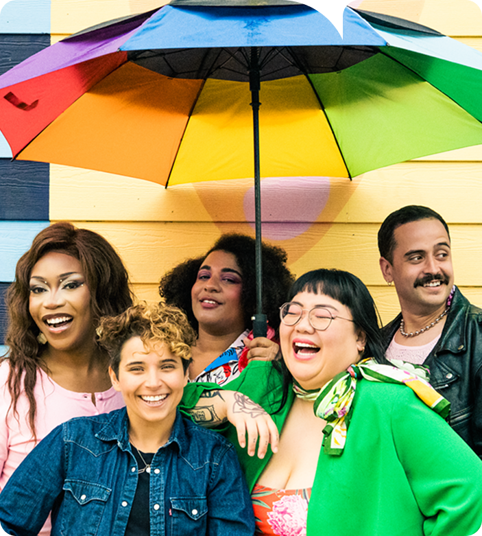
QMUNITY is a non-profit organization offering low-barrier mental health and social services for queer, trans, and Two-Spirit folk across BC. From youth to seniors, they help people find belonging and access vital programs and resources—no matter where they are in their journey.
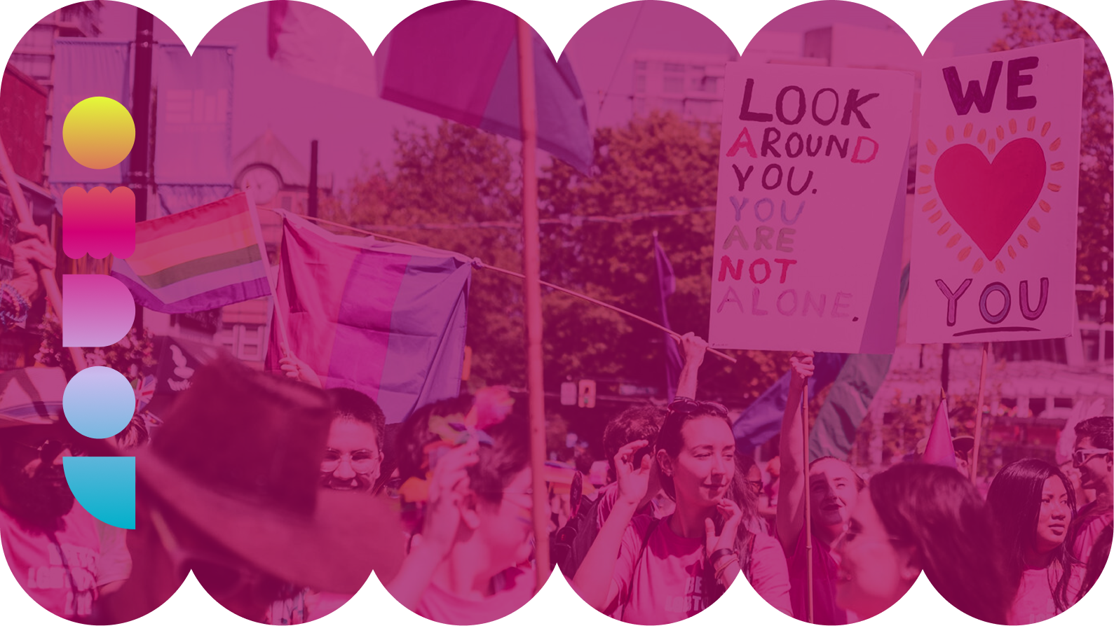
For over 45 years, QMUNITY has been a lifeline for 2SLGBTQIA+ people in Vancouver and across BC. Yet, their site needed an update to match the heart and impact of their work. We set out to create a more inclusive, accessible, and resonant website. One that showcases their province-wide reach, facilitates donations and engagement, and strengthens their leadership in queer community care.
Our Strategy
THE CHALLENGE
Designing for discovery and trust
Visitors come to QMUNITY with a range of questions and needs—some seeking specific services, and others unsure of their next step. The website had to help them feel seen, and serve as a bridge to the right resources.
But with so many programs, services, and resources scattered across the site, navigating them was overwhelming. The core challenge was transforming this complexity into an intuitive experience—one that guided visitors through triage to the right resources, and helped them self-identify accurately.
The website had to reflect QMUNITY’s low-barrier, wraparound care with a flexible design and multiple pathways to support. The site also needed to advance key goals: increase program signups, grow donations, and engage funders and partner orgs. Finally, the brand needed a refresh to reflect who QMUNITY is today—bold, inclusive, and deeply connected to the community it serves.
THE RESEARCH
“You belong here”
We began with research and strategy, interviewing QMUNITY’s team to map program intake processes, identify pain points, and understand how people currently navigate their services.
Their audience spans generations, cultures, and levels of digital literacy, from youth as young as 11, seniors in their 90s, newcomers with limited English, and supporters of all kinds. Accessibility and mobile-readiness were key. So was representing QMUNITY’s role as a connector, since people may visit the site for a single need but discover a broader network of care. Whether navigating coming out, legal support, or counselling services, visitors needed to feel welcome and supported.

THE DIRECTION
Human-centred design, inside and out
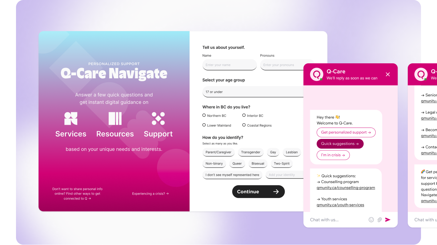
We reimagined the site with a new sitemap, intuitive architecture, and a “Q-Care Navigate” triage flow to guide users to the right resources. On the backend, we built tools to simplify program signups for frontline volunteers and integrated a personalized chatbot to lead users through the triage.
The research
Benefits over technology
Our Vision Cycle research revealed that 78% of talent professionals believe diversity is the most important factor influencing the way they hire, but only 12% achieve optimal levels. Most enterprise businesses want to, but are failing in their attempts to diversify the employee pool.
Our research also identified a clear need for AI and unbiased data in recruiting, but the technology itself was not inherently valued by prospective clients. Leading with features appealed to the Pymetrics team, but wouldn’t resonate with this audience. Pymetrics needed to position on core value outcomes over the machine learning algorithms to get there.

of talent professionals and hiring managers say diversity is the most important factor influencing the way they hire.
beileve their organizations provide excellent training against unconscious bais
have reached optimal levels of inclusive company culture
The research
Amplify a layer of humanity
With this knowledge in hand, we set to work creating a unique visual language that would represent the work their machine learning was doing around benefits-focused copy, without emphasizing the technology itself.
But what direction could we take? Neural networks? —Nope, overused. Training models? —Nope, for data scientists, not hiring professionals. Whatever we did had to have a human angle and effectively communicate the emotion of landing a new employee within diversity and inclusion guidelines.
And then inspiration struck from an unexpected place.
Ever played this game as a child?


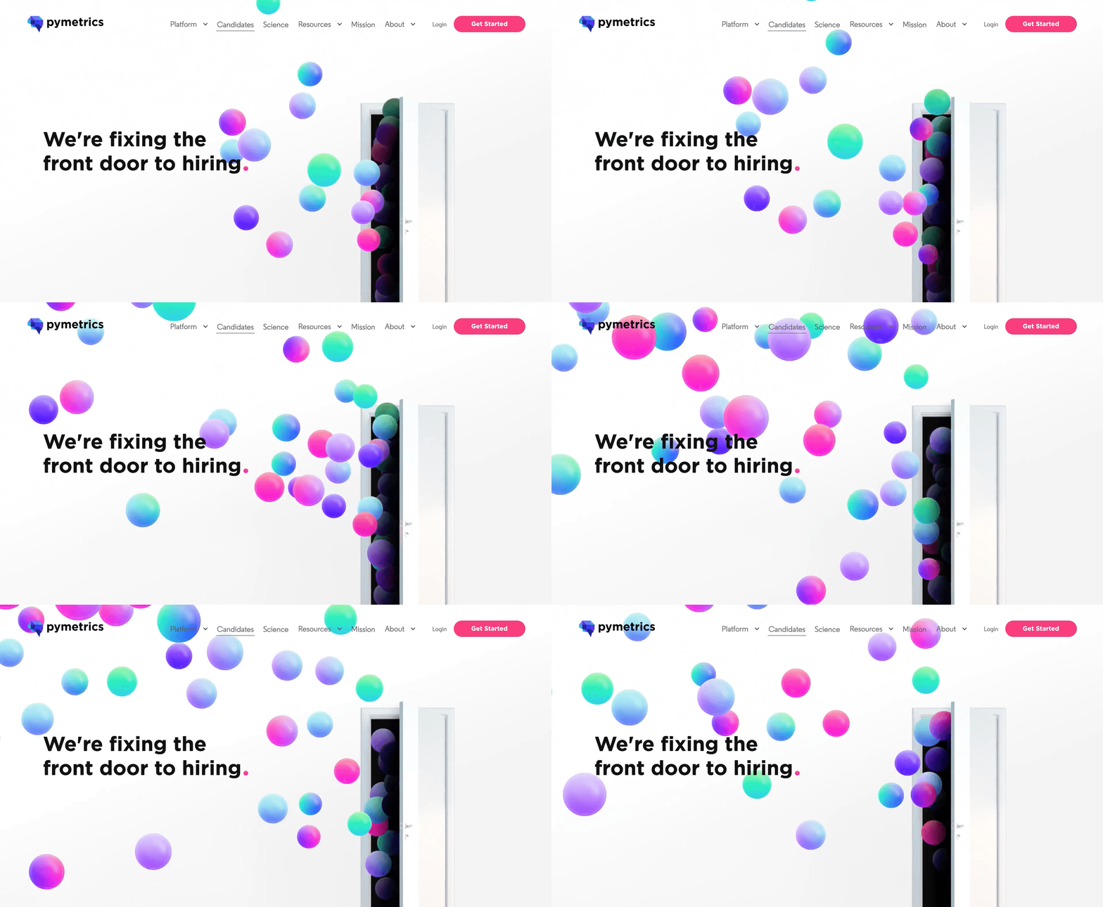
Spheres with unique colors would represent candidates and flood into the organization, then be carefully redirected based on interview, assessment and the talent matching A.I.

Our Solution.


The moral of the story
To developers and beyond
Like many of our early stage clients, Pymetrics was focused deeply on the product AI features and training massive data sets and unable to see the buyer.
When our research proved that the buyer, although interested in AI, was not looking specifically for an AI solution, we knew we needed to shift to highlighting outcomes. And to resonate with outcomes, you need to lead with emotion—even for the most sophisticated, enterprise buyer, and a unique visual language can do that well.
"Resonating with clients very well ... all good and great to have an amazing new site... we'll continue to optimize with your team. Thanks!!!"
- Bob Toohey, President at Pymetrics